Case Study

Project: Zendale

Industry: Real Estate

Brief

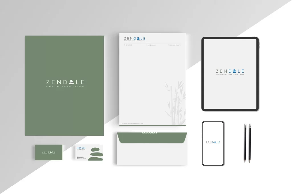
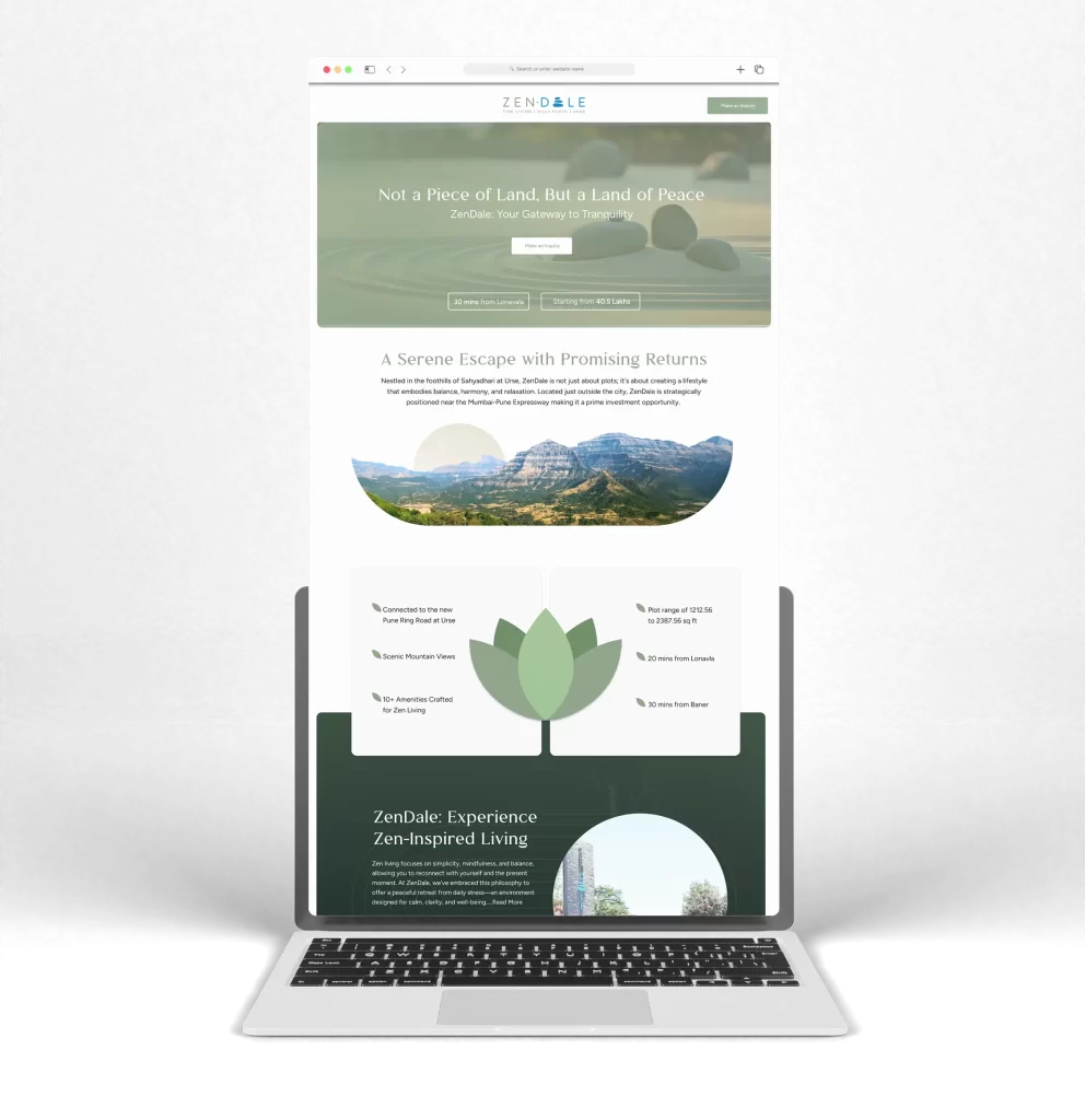
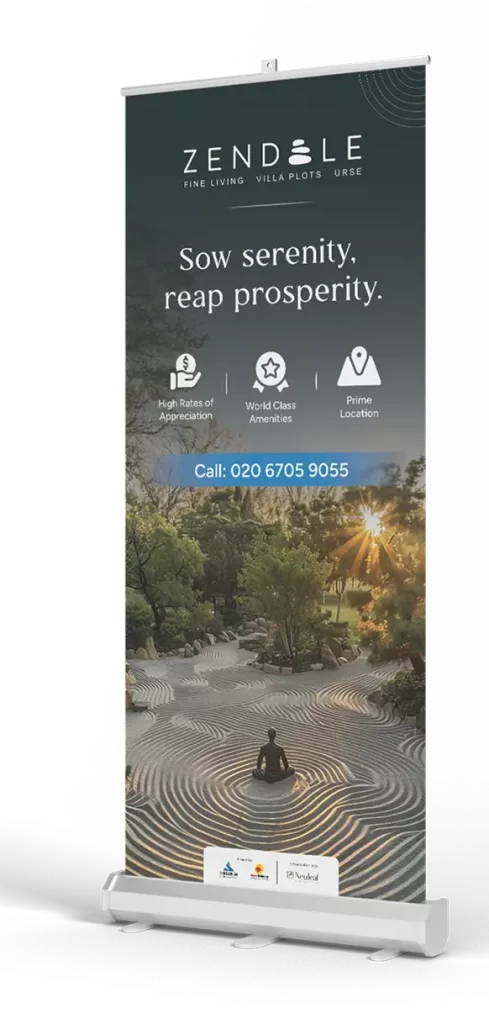
The Zen-Dale project focused on promoting the tranquil lifestyles of its residential plots, highlighting the harmony between nature and modern living. The challenge was to emphasize both the peaceful environment and its prime location near the Pune-Mumbai Expressway, appealing to families seeking serenity and convenience

About Company

Zen-Dale is a Zen inspired picturesque residential project located in a serene locale of Urse, Pune

Brand Guidlines

Typography

Aa

Pimary Font - Lancea

Body copy Font - Figtree

A B C D E F G H I J K L M N O P Q R S T U V W X Y Z

ABCDEFGHIJKLMNOPQRSTUVWXYZ

1234567890

Colors

Primary
#056DFA

Secondary
#1F7BBA

#056DFA

#056DFA

A palette of Sage Green, Slate, and Earthy Wood tones. The logo features a stacked stone motif (Cairn), symbolizing balance and the “journey” to tranquility.

Logo Concept

Stationary mockup

Brochure

Website

Not a piece of land, but a land of peace. We built a website that translates serenity into sales, achieving a 20% conversion rate through intuitive UI and emotive storytelling.

Results

The ZenDale campaign successfully transformed raw land into a coveted lifestyle brand, shifting the conversation from “investment” to “aspiration.”

20%

Site visit conversion rate

40%

Sold Phase 1 inventory

90%

Positive sentiment in buyer surveys.

Standee

Kind words from clients

They truly captured Zen-Daleโ€™s essence. This branding and website perfectly reflect the peaceful, modern lifestyle we offer. Great team to work with!

-Atul Jethmalani, Director