Redesigning the website to improve user experience and conversion rates
Website Re-design
Project Duration: Mar 2024 - July 2024
Background
SPARK is a unique art class operating out of New York that combines Art, Yoga, Meditation & Nature for children with their programs. SPARK approached MMAG for a website redesign as they wanted to include various services and offerings for their second location at Pennsylvania.
Wanna hear the story?
The Challenges
Audit for the then-current website identified the following problems
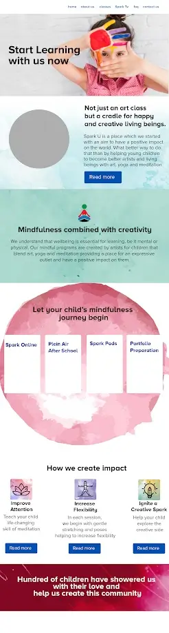
- Hygiene issues affected text readability, flow, and alignment, potentially disrupting experience for users seeking information about SPARK.
- The cluttered homepage detracted from the overall user experience, potentially hindering visitors' ability to navigate and access relevant information efficiently.
- Inconsistent design elements across various sections contributed to a disjointed browsing experience, potentially hindering user engagement and comprehension.
- Lack of visual hierarchy resulted in non-critical elements overshadowing significant content, diminishing its impact on users.
The Tactics
Visual Clarity & Information Architecture:
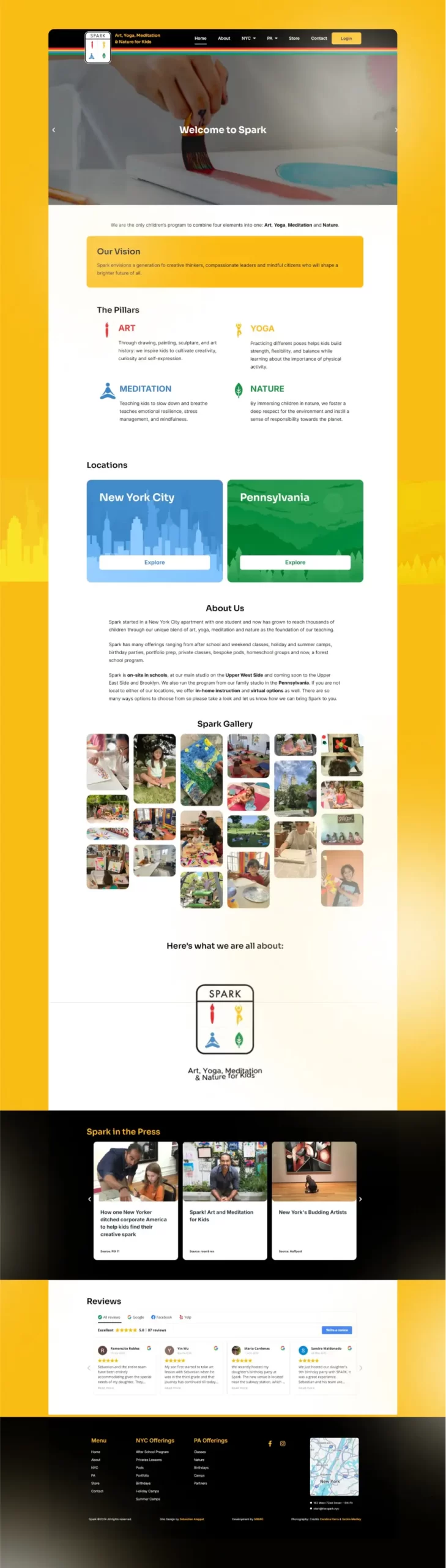
Established a robust design system featuring standardized typography, consistent spacing rules, and compliant color contrast ratios. This systematically addressed both readability issues and design inconsistencies across the platform.
Implemented a strategic grid-based layout with deliberate use of white space, transforming the previously cluttered homepage into an organized, scannable interface.
Visual Clarity & Information Architecture:
Established a robust design system featuring standardized typography, consistent spacing rules, and compliant color contrast ratios. This systematically addressed both readability issues and design inconsistencies across the platform.
Implemented a strategic grid-based layout with deliberate use of white space, transforming the previously cluttered homepage into an organized, scannable interface.
Content Hierarchy & User Experience:
Developed a clear visual hierarchy through thoughtful typography scaling, strategic color usage, and intentional positioning of elements. This ensured critical information stood out while maintaining a harmonious overall design.
Streamlined the user journey by introducing clear sections with distinct focal points and intuitive navigation patterns, significantly improving the website’s information flow.
Design Consistency & Accessibility:
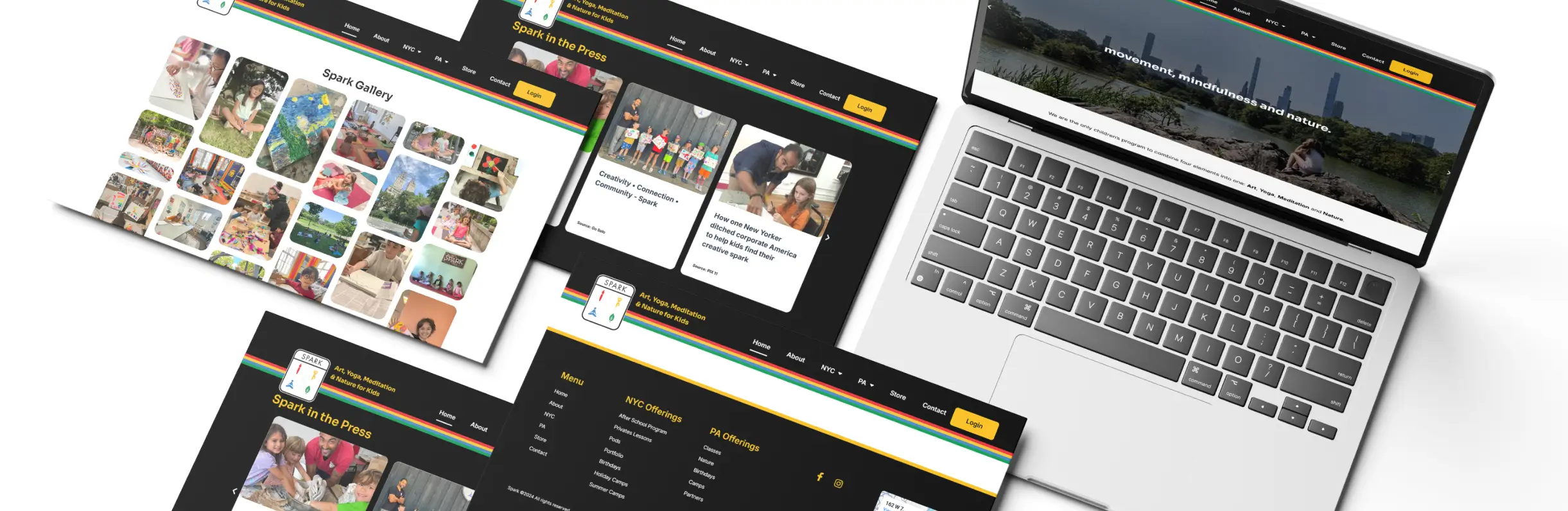
Created a unified design language with standardized components, consistent interactive elements, and documented guidelines, ensuring a cohesive experience across all pages.
Enhanced the overall user experience by balancing essential information with sufficient breathing space, making the website both visually appealing and functionally efficient.
